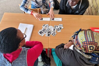
Learning & teaching

Graphs are perceived and interpreted more strongly than just numbers or text. If there is a contradiction, we easily believe what we see.
Graphs are perceived and interpreted more strongly than just numbers or text. If there is a contradiction, we easily believe what we see.
Statistics are used for clarifying big data and making it more comprehensible. They can also be used in misleading ways, either by accident or in order to influence us. Do we actually understand statistics and the numbers behind all the news?
The number of reported cases, case fatality rate, infection fatality rate, total mortality, actual deaths, the most cases in the world, per day, per capita, biggest increase, percentage of those who have recovered….
In this time of pandemic, statistics and probabilities have become everyday life to all the Europeans following the time and the news. Statistics and key figures are actually the basis behind all the news, whether it is about politics, global warming, economics or the popularity of blockbuster movies.
Statistics in the media might be implicit, for example in a form of graphs, or they form the basis for the news analysis.
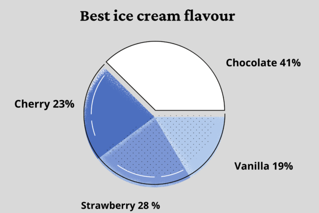
What is wrong with the pie chart?
Comprehending the basics of how statistics are formed and presented and being critical of sources are an important aspect of media literacy and a civic skill everyone should have.
Statistical literacy is defined as critical thinking about numbers and statistics used as evidence in arguments and causal connections. Secondly, it is the ability to read and interpret numbers in statements, surveys, tables and graphs.
“Also, understanding societal phenomena and terms, like inflation or GDP, is crucial in reading statistics. But it is not rocket science on the level of an ordinary citizen,” says Reija Helenius, group leader of Communication and Networks from Statistics Finland.
From 2010 she has worked as the Director of The International Statistical Literacy Project, ISLP, a network of 80 countries, which promotes statistical literacy across the world.
How would the chart look like with fixed x- and y-axes?
“We use different forms of activities to teach how to create and understand statistics. For example, over 15.000 students annually take part in an international poster competition, where the aim is to follow a research process; first you formulate a research problem, collect or use ready data and then analyse and illustrate interpretation of the statistical information.”
The teaching of the statistical literacy of ISLP, and other organisations, like the European Statistical System with its European Statistics Olympics, mainly target children and school pupils. The other popular target group are the academics.
“In the EU countries, there has been more investment in the teaching of statistics in schools in recent years and games, for example, have been developed for this purpose. Teachers are more aware that statistical literacy is linked to media literacy and is an important civic skill,” Helenius says.
The current pandemic and the statistical news around it have increased the interest in statistics. While there are more webinars, podcasts and open lectures, organised adult education in this field is, however, not that common yet.
“It’s easy to reach the youth and get them motivated and inspired, but what would be the means to inspire 50-70-year-olds to learn more about statistics?”, Helenius wonders.
One important factor in teaching statistical literacy, including for adults, are journalists. ISLP has been trying to obtain funding for trainings on statistics for journalists, but so far with no luck.
“It makes a significant impact on a societal level how media shows statistical graphs and concepts, and how, through them, we are taught about societal phenomena in an understandable way,” Helenius says.
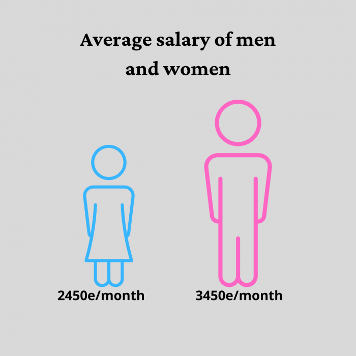
What is the average colour of women?
Sometimes mistakes in the media are due to lack of knowledge of how to interpret statistics. According to Pauliina Ilmonen, Assistant Professor of Statistics at Aalto University in Finland, media outlets have fortunately increased their responsibility for this, at least in Finland.
“I’m happy to hear that more data scientists have been hired by media houses to help journalists to create accurate, correctly interpreted and easy-to-understand journalism with regard to numbers and statistics.”
In trustworthy media, mistakes in statistics are in most cases not intentional, Ilmonen assumes. She regularly gets calls from journalists asking to check whether their statistics-based news or graphs are correct.
There is, however, a possibility to use statistics in misleading ways, for example for political, economic or commercial purposes.
“This can be seen in some international media. The data is collected solely from a certain forum with one-sided opinions, or a graph shows only a certain period of data, the one most beneficial for the reporter although, in a longer time frame, the decline or spur can be seen to be only a seasonal fluctuation,” Ilmonen says.
As far as news about the pandemic is concerned, the statistics experts stress source criticism and patience.
“We have a new virus about which we do not have much basic knowledge. Researchers and healthcare systems are under tremendous pressure,” says Ilmonen.
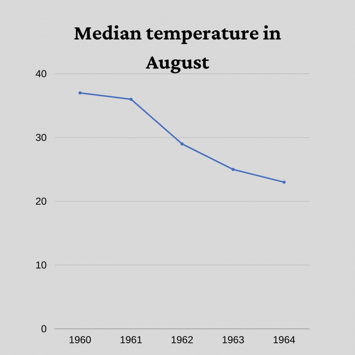
Trending up or down?
Because the pandemic is still ongoing, mathematical models around it are hard to create.
“There is uncertainty and delay in the statistics. There are differences in the ways that cases are statistically reported. There is underestimation. There is confusion in the terms and translation. There simply is not enough information for sufficient mathematical models,” Ilmonen says.
Nevertheless, at present thousands of scientists, data scientists and journalists are all striving to give us the best statistics, data, analyses and news on the subject. Meanwhile, it is our task as citizens to be critical of the oversimplification of statistical analyses, vague expressions like ‘the average’ and graphs that do not obey the numbers.
Reading graphs
Mathematical terms are non-commutable. When the term ‘average’ is used, it does not tell whether it is sample mean, media, weighted sample mean or something else. If there is skewed distribution, the selected term makes a very big difference. For example, it is mathematically correct to say the average European is half a woman and half a man.
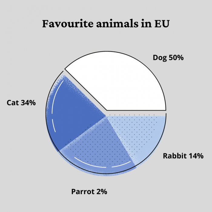
Visual images are perceived and interpreted more strongly than just numbers or text. Even if the percentages are correct in a pie chart, the visuals should also follow the correct size.
Accidental mistakes are made in the choice of colour. If the intensity of a colour is strong, the image or proportion may look larger than it actually is.
The choice of colour must also have context. For example, the colours of political parties usually follow the colours in the graphs. If you counter the conventions, people might remember only the graphics and not the numbers behind it.
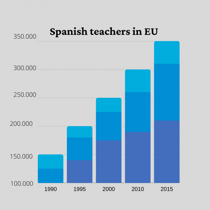
The scale of the bar chart should always start from zero, so that the proportions of the bars remain correct with respect to the ratios of the values they describe.
Trendlines show only a certain timeframe, so care is needed when interpreting them.
A trendline might appear to show a decline, but when you zoom out and show a longer time period, the trendline is actually rising. The decline in the first image with a shorter time span is just cyclic change if we look at it from a wider perspective.
Common misleading examples of statistics and graphs were provided by Assistant Professor Pauliina Ilmonen.